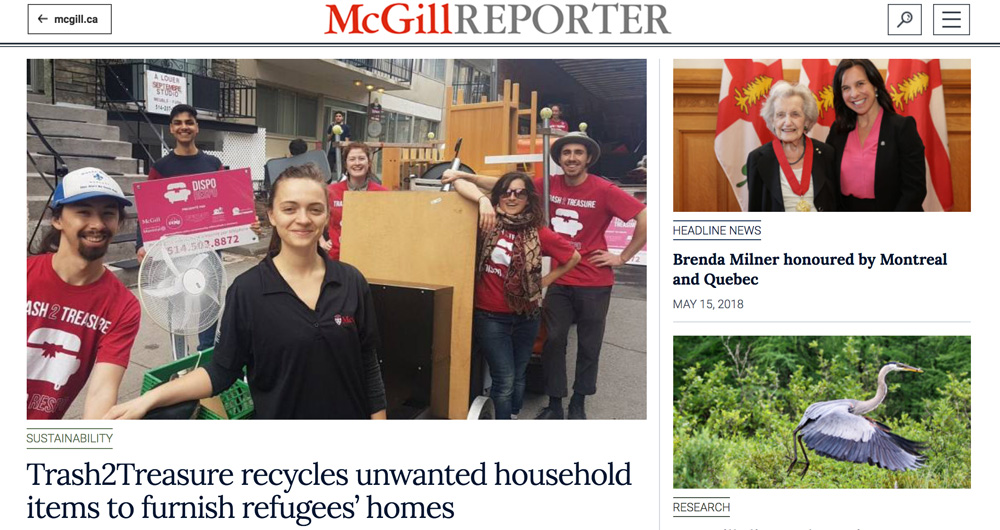
Yes, this is still the McGill Reporter. But we’re updating our online look with a top-to-bottom refresh to keep us current with the evolution of news website design.
The project, which began last year, has taken us through an examination of what we do (convey news and information about McGill University and the members of its vast community), how we do it and how we can do it better.
Thanks to the hard work of McGill’s Digital Design Manager Heidi Strohl and that of Erick Frappier of the Montreal web design firm Zaa.CC, we think we’ve got a fresh, readable site that delivers more content at a glance while maintaining an airy, welcoming look.
Two fonts were chosen to not only match those in the McGill style guide, but to make headlines, photo captions and stories more readable. Roboto is the sans serif font and Lora is the serif, used in most body type.
“This performs better at small sizes than the old font, Georgia,” Strohl said. “It’s a more modern, web-optimized font.”
McGill Reporter Editor Neale McDevitt, who manages the site and its content, is delighted with the new look and the various possibilities it offers for presenting stories and pictures in a livelier and more readable fashion.
“I’m really excited by the things we’ll be able to do with this site,” McDevitt said. “It will take a bit of getting used to – for us as well as our readers – but I’m confident we’ll take readership to new heights and enhance our readers’ experiences with us.”
It has been a decade since we last refreshed the McGill Reporter’s look and moved to a WordPress platform. In that intervening period, a lot has changed in terms of design trends, the optimization of typography for the web and finding the most effective ways of presenting text and photography in order to convey information.
There have also been significant changes in how people connect with us. Most important for our new site are the improvements made to the way it looks on different platforms. More and more people are viewing our content through smartphones and tablets and we needed a site that works well in those formats.
“My goal was to make the website as easy and fun to read as possible on any platform,” Strohl said. “Where this website really shines is on all the different platforms – desktop, laptop, tablet and smart phone. Anyone can see this by resizing the browser and watch the site morph before their very eyes.”
Today, we’re kicking off with a “soft launch” to allow us to get used to a site that is quite different from its predecessor and to iron out any bugs that might lurk somewhere in the architecture (so please bear with us).
In late summer, we’ll do a bigger launch with some exciting new content we think you’ll enjoy.
There are also some things that haven’t changed. “We are still committed to providing timely, interesting and lively content about our community,” McDevitt said. “McGill is a fascinating place filled with interesting people doing amazing things. There are so many stories to tell and so much information to convey. We think this new site will help us take that to a new level. We hope our readers will come along for what promises to be a fun, exciting ride!”
