Unsure how to use the McGill logo on your conference poster? Need to create an avatar for your unit’s Twitter account? Baffled by what people mean when they say “McGill red”?
The new Visual Identity Guide will answer all those questions, and more. (Spoiler: McGill’s official red is CMYK 0 100 90 0.)
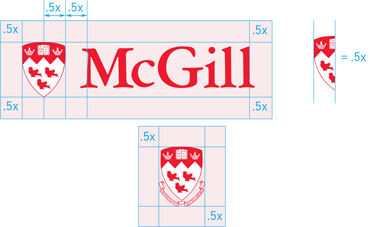
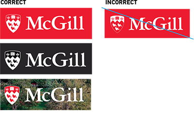
Whether you’re a designer or you’re managing a design project, the guide offers concrete instructions for how to use the University’s official logos, colours, and fonts to create professional, consistent visual elements that reinforce McGill’s reputation for excellence—while still allowing creative elbow-room for expressing a unit’s own identity. There are also templates for producing commonplace materials, such as letterhead and labels, and downloadable hi-res logos.
The Office of Communications and External Relations (CER) developed these comprehensive standards in consultation with collaborators across the University. (The CER office now oversees the trademark policy and all things pertaining to visual ID, which were previously the purview of Secretariat.) CER’s Graphic Design team, led by designer Jean-Bernard Ng Man Sun, updated existing standards and developed additional rules for the use of colour palettes and fonts.
The guide uses copious illustrations to demystify the dos and don’ts of working with the McGill visual identity. CER is happy to answer any additional questions you may have.
(Units wanting more hands-on assistance with their graphic design needs can hire CER’s Graphic Design studio. Visit their website to browse their portfolio and to initiate a project.)
When used with consistency, logos and other graphic design elements can protect and strengthen a brand. The main purpose of the Visual Identity Guide is to help members of the McGill community collectively project a consistent image across a vast array of websites, printed documents, and branded collateral such as banners, signs, posters, and merchandise.
“Professionals across the communication industry agree that consistency increases the effectiveness of communication materials,” says Louis Arseneault, Vice-Principal (CER). “McGill is a huge, diverse community. There are 1.5 million pages as part of the 850 websites on mcgill.ca alone. It’s a challenge to make a wealth of different materials instantly recognizable as all being ‘McGill.’”
“One logo on one poster might not seem like a big deal, but every logo adds up,” says Arseneault. “There’s a cumulative effect. By helping people to create visual consistency at the individual and unit level, together we’ll create a stronger sense of institutional cohesion.”