By McGill Reporter Staff
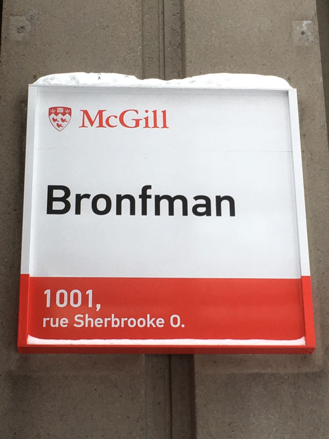
New font, new materials, new design. You may have noticed that building signs on McGill’s downtown campus have a new look (with those at Macdonald Campus soon to follow). Most of the signs now include only the name of the building and its address, a modern design practice observed at leading North American universities, says the manager of the project.
“Our new design is similar to what can be seen at Yale and Harvard,” says Virginie St-Pierre, Design Manager at Design Services, part of Facilities Management and Ancillary Services.
The replacement of the old signs was long overdue: the signs were over 20 years old and in some cases, red had become pink and white had yellowed. There was also some inconsistency in the information that was presented from one sign to another, as well as between campuses. The decision by the University to no longer include occupants of the building was carefully thought out.
“Units can move so if we include mention of the occupants of the building in the sign, it considerably reduces the sign’s lifespan,” St-Pierre points out.
Also, Quebec language laws dictate that all exterior signage be bilingual so every detail must be provided in French and English, which can clutter up the signs.
Project completion to coincide with 375th-anniversary celebrations
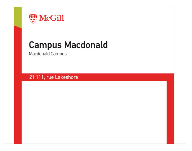
The replacement of building signs is part of a larger overhaul of exterior signage on McGill campuses. The plan includes adding wayfinding signage on the downtown campus – there is none at the moment – and changing the signage that directs people across Macdonald Campus and at Mont Saint-Hilaire’s Gault Reserve (which McGill owns).
The design of the signs will be consistent across campuses: standing signs with arrows indicating locations of buildings or areas of the campus where faculties are concentrated (engineering, for example).
“We will highlight Mac and Gault’s distinctiveness though with a green accent in Mac signs and a brown [wood] one in Gault signs,” says St-Pierre.
The maps at the entrances of McGill campuses will also be replaced and an interactive terminal installed at Roddick Gates so visitors can learn more about McGill and the downtown campus.
Though the signage overhaul took longer than expected, the completion of the project this summer actually works out well, given the increased number of visitors expected near and on campus thanks to the Promenade Fleuve-Montagne the City is designing as part of the 375th-anniversary celebrations.
“McGill is one of the most beautiful university campuses in the world,” says St-Pierre. “We must live up to this even in the small details.”